Foundational Hand – Proportions
After studying Roman Capitals, next on the list is the Foundational Hand, sometimes called Roman Minuscules. The Foundational Hand are the lower-case letters written beside Roman Capitals.
As with the Roman Capitals we need to study the proportion of the letters before we pick up a calligraphy pen and make a start with some sample sheets. You will produce much better letterforms by learning the structure and proportions of each letter.
The letters of the Foundational Hand have different widths; the obvious example is the letter i compared to the letter m or w. Each letter can be grouped according to its widths. So, instead of having 26 letters of different widths, there are in fact only 2 groups of letters, plus a few odd sized letters to learn.
The Grid
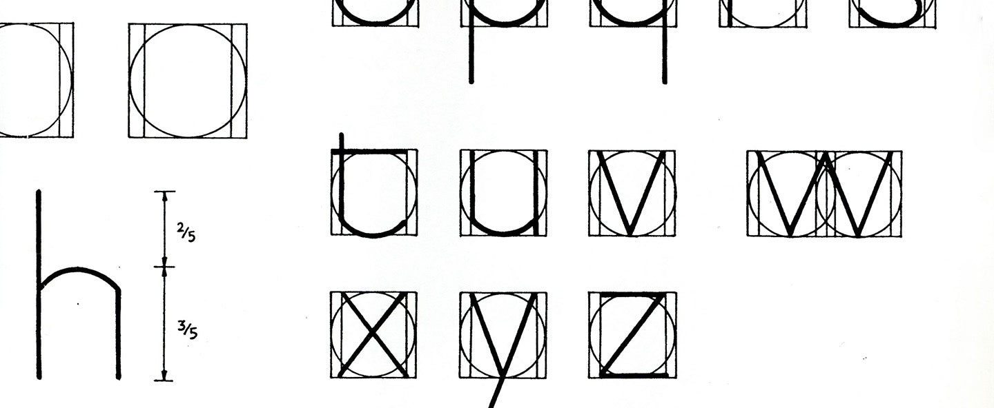
To help get these widths correct we can construct a grid, where each letter can be placed inside. This grid is exactly the same as the grid constructed for the Roman Capitals. It consists of a square and inside it a circle that just touches the lines of the square in four places. Within the square, there is also a rectangle. This rectangle is three quarters the size of the square and is positioned in the centre of the square.

Ascenders, Descenders and x-height
Some of the Foundational Hand letters have ascenders and descenders. Ascenders are strokes that go above the x-height of the letter. Descenders are the strokes that go below the write-line of the letters. X-height refers to the height of letters that have no ascender or descender i.e. the height of the letter x. I guess it could have been called the a-height or o-height etc.
Groups of Letters
The Foundational Hand has two main groups of letters.
The 3/4 Width Group
The letters in this group are a, f, g, h, k, l, n, r, s, t, u, v, x, y and z. These letters basically fit in to the rectangle part of our grid, which is three-quarters the width of the square.
With many of the letters in this group you will find that they pick-up and leave the circle, within the rectangle. So, the letter a is the width of the rectangle and the curves at the top and bottom of the letterform are from the circle of the grid.

The letter f picks up an imaginary circle plotted above the grid. The overall height of the letter is the same as other letters who have an ascender – b, d etc.
The letter k is quite easy, but if the bottom angled stroke does not extend further out than the top angled line the letter will look like it is about to fall over.


Letters n, r, t, u, v, x, y and z are straight-forward. The letters v and y are the same except the second stroke extends to the length of a descender when writing the y.
The letter h is the same as the letter n except it has an ascender. The letter l is similar to the letter b, except it is not as wide.
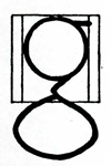
Letter g is tricky. The top circle of the letter is 3/4 width, where as the oval that sits below the write-line is the full width of the grid. Were it the same width, the overall shape of the g would look odd.

In this 3/4 width group we are only left with the letter s, which by far the hardest letter in the group. When writing this letter, remember the underlying circle shape, which the letter s starts on, leaves and then re-joins.

The 7/8 Width Group
The letters in this group are b, c, d, e, p and q. All these letters are based on the circle, but none of them are the full width of the circle.
In many ways b and d are very similar as are p and q.


Letters c and e are almost full circles.
Odd Groups
We have 5 letters of the alphabet left to construct, but none of them belong to either of our two main groups.

Letters i and j are linear, except j has a curved descender based on a small circle.
The letter m is simply two n letters ‘stuck together’. The same is true for w which two v letters drawn together. This actually makes m and w have an overall width of 1.5, which makes them the widest letters in the alphabet.
Finally, the letter o is simply the full circle.
