Roman Capitals – Letter and Word Spacing
It is easy to understand why you put all your effort in to producing correctly proportioned letterforms. Whilst the letters are very important, bad letter and word spacing will distract from the lettering. Can you imagine looking at a piece of work with beautiful lettering only to be distracted by poor spacing?
Spacing can make or break a piece of work. It is advisable to spend lots of time learning the correct spacing for the style of writing. If you learn the spacing rules early on you can apply them whilst you are practising your letterforms. So instead of just writing one letter after another, you also think about where the second letter being practised should start relative to the previous letter.
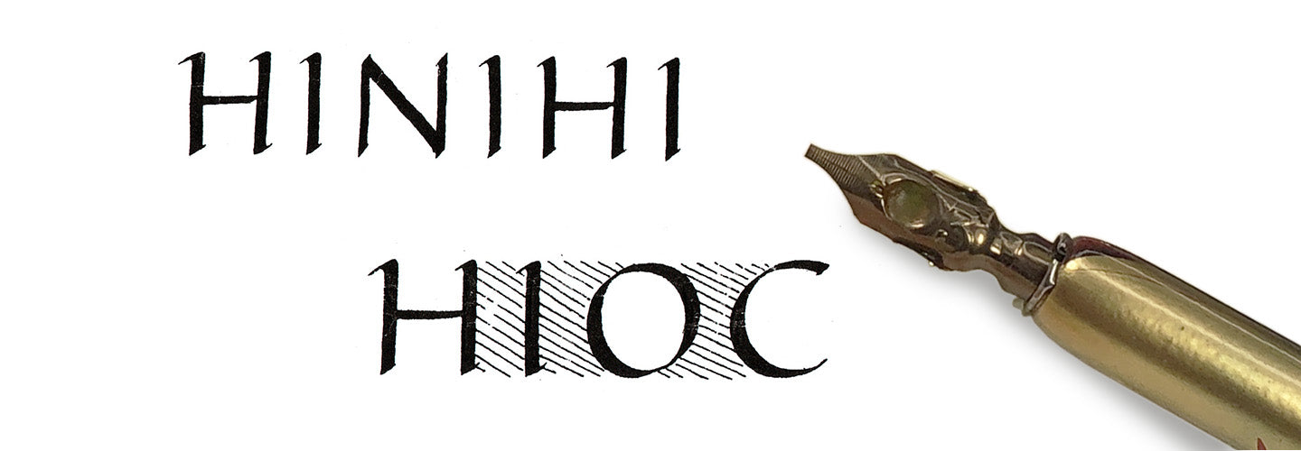
Spacing rules vary with different styles of writing. With Roman Capitals the space between letters should be such that there is an equal area between the letters. Letter spacing should be adjusted such that the area between any two letters is equal. There should be an even-looking space between and around the letters.
Letter Spacing
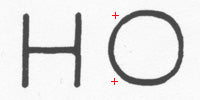
Two straight letters are furthest apart If you start with two ‘straight’ letters N and N, there will be an area between these letters. The two straight letters are 5/8 the height of the letter apart. So, if you had an x-height of 10mm the distance between the straight letters would be 6mm.If you produced these letters on a piece of graph paper you could add up all the (millimetre) squares and you would know the area between the letters.
A straight and a curved letter are slightly closer together The distance between a straight letter and a curved letter is adjusted such that the area between the letters is the same as two straight letters. For example, a curved letter O will be will closer to the straight letter N than another straight letter. Why is this?Well, remember, we are dealing with the area between letters and so we have to allow for the space at the top and bottom of the curved letter. All the partial squares along with the whole squares created by our two letterforms needs to add up to the same number of squares (area) as our two straight letters.
Two curved letters are closest together

When writing two curved letters together, for example O and another O they will be close together. This is because we need to allow for the area above and below each curved letter. Keeping with the graph paper idea we now have lots of partial squares created by the curved shapes. However, if we could add all these fragments up, it should still be the same area as the two straight letters. Some combinations of letters are relatively easy to space, other letter combinations are more difficult. The problems start when you have letters, for example, C followed by a Y or an E next to a J. With the type of combinations you have to consider the space inside the letters. In practice this means some letters are written very close together. Examples include ‘TT’ ‘RY’. This is because the letters have a lot of space associated with them meaning if the spacing rules were applied there would not be an evenness of space. The letters are close together because the eye reads part of the space within the letter area together with the interletter space.
Word Spacing
The letter O is used as a guide for the inter-word spacing. However, this will also need adjusting depending upon the last letter of the word and the first letter of the next word. This can result in the word spacing being reduced to compensate for the space around some letters.
