When things go wrong… Dealing with it
Sometimes with the best care we still find something has gone awry.
When you notice something has gone wrong, often the best thing to do is go and have a cup of tea. (An exception to that is if the bottle of ink is still pouring over your work, down your drawing board and onto the floor – a spot of mopping up followed by a cup of tea.)
This helps put the problem in perspective, and allows you to use your creative brain to think of ways to deal with the problem.
Single letter or word rescues
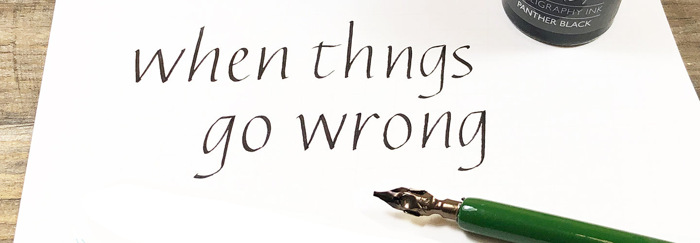
These can be achieved where the correction can be made without compromising the spacing of the lettering. A simple example would be that you’ve written “fail” instead of “foil”, or “wrong” instead or wrath”.
In this situation it is tempting to remove the wrong letters and write the correct ones in place. A better approach is to write the correct letter(s) before doing any erasing. This might feel mad, but in fact you should find that you’ve less wrong bits to remove by working this way.
Once the correct letters are properly dry you can start removing the wrong letter(s). This can be done by painting over them with Dr Martin’s Bleedproof White or white gouache (assuming the paper is white) or – if you’ve used gouache or stick ink – by scratching the wrong parts of the letters away very carefully with a scalpel.
The best thing about this approach is that you never need to write on the paper that you’ve scratched, because you’ve already written the correct letters.
Missing a letter, a word or more.
You’re going to have to see if you can come up with an imaginative way to correct the problem.
A good correction is either invisible or honest correction – so the reader either has no idea a correction took place, or they can see how you coped with the problem and will almost certainly smile and empathise with your great rescuing skills.
An example of an honest rescue would be to include the missing letter in a creative way, such as this delightful correction by Jan Pickett in a classroom demonstration piece.

With good quality papers it’s possible to add a paper patch and make it almost invisible.

Take a piece of the same paper, cut to the right shape, and gently chamfer the edges of the paper by lightly sanding it on the back.

Using a glue that won’t wrinkle (such as a very fine coating of PVA) and making sure the glue is up to the edge of the patch lay it in place and gently press it down. Be careful not to let any of the glue squeeze out and show.

Once dry use a bone folder or similar to smooth down the edges – it’s best to use a scrap sheet over where you are burnishing to prevent making your beautiful paper shiny.
What you don’t want is an obvious compromise that spoils your beautiful lettering.
Something worse. You’re going to be weighing up the complexity of the rescue with how well the rescue is going to be hidden. It’s always worth seeking the views of others In the end, sometimes there’s no good way to satisfactorily correct a mistake, and then you simply learn from the experience and start again. (Being grateful for the extra practice you’ve had!).
Remember that you’re in good company if you need to correct an error. Perhaps the most amazing piece of calligraphy of the modern day, the St Johns Bible, includes some charming examples of honest correction.
One more thought. It’s almost certain that you’re going to remember where the error was, and therefore you’re probably going to be able to see it too. Try and resist the temptation that most calligraphers seem to succumb to – don’t point it out to everyone who looks at the piece! There’s little point in going to all the trouble of fixing a problem if you’re just going to tell everyone it’s there.
