Copperplate Facebook Cover Photo
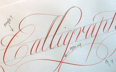
A Copperplate Facebook cover photo was designed for us by Rachel Yallop. This time ‘Scribblers Calligraphy’ has been written in a wonderfully flourished Copperplate style. Here, Rachel describes how she developed her ideas and fine-tuned the design to produce a very elegant and flourished final piece.
I am passionate about copperplate. It is, for me, one of the most beautiful and elegant scripts. I am also passionate about drawing and when I’m writing copperplate I feel very much as if I’m drawing letters in a way that I don’t with other formal scripts. Copperplate requires a steady hand and minute attention to detail. I practice the ‘swelling line’ style, where strokes start fine, swell to thickness in the middle and then become fine again at the end. I think this is the most elegant way. There are others, and neither is right or wrong.
My favourite copperplate nib is the Gillott 303, so I used this and vermilion red Schmincke Calligraphy gouache for the new Scribblers cover image. The Gillott 303 has a fine point and is very flexible so will open up well for the thick strokes. I always use a straight holder, finding the angled ones too awkward and leaving me feeling somehow removed from the paper.
I began by writing Scribblers Calligraphy at an x-height of 10mm with flourishes extending from some of the letters. Starting to write, for example, an l from the top down and then going back to the top to add a curved stroke, (rather than starting the letter from the bottom and getting a looped ascender) has opened up so many flourishing possibilities for me. It means here that I was able to create a slightly different look to the double b and double l and not have a repetitive loop.

The l after the double b remains straight and plain to act as a foil. There is also a repeat of this in the straight p of Calligraphy.

The format for these cover images is long and fairly narrow: a ratio of about 100/35. Although Calligraphy has ascenders and descenders in all the right places (!), Scribblers was singularly lacking in descenders, so I made a flourish coming from the s which I think works without it appearing to be some new invented letter.
After working out the design as I went along, it became clear that I should increase the x-height in order to fill the space better, while still keeping the same length and without giving too compressed an appearance. Once happy with the design I just kept writing it until I had a version I was satisfied with…probably about four times!

We are very grateful to Rachel for kindly producing our new Facebook Cover Photo. ‘Like’ Rachel’s Facebook page to see more of her Copperplate calligraphy.
