Creating a Facebook Cover Photo
Whilst designing a Facebook cover photo, Rachel Yallop. kindly agreed to make notes, to give us a better understanding of how a professional lettering artist approaches and creates such a lively and eye-catching piece of work.
I’ve recently rediscovered the Zig Art & Graphic Twin felt pen and have been experimenting quite a bit with it. It flows so perfectly, can be used at speed, manipulated with pressure and release and of course there’s no need for re-dipping in ink! I’ve found it works really well on marker paper though something a little more textured is also good.
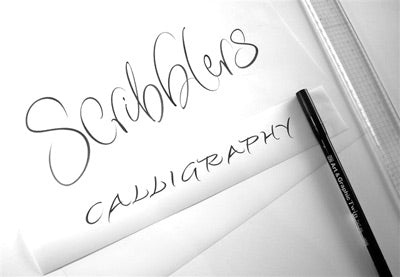
I made the decision to write the Scribblers Calligraphy title in a free and lively style using the Zig pen. With little time to experiment, and being used to turning round commercial lettering very rapidly, I often have to make quick decisions about what will, and will not, work.

I rarely do roughs, finding it better to just start. I do think carefully about how the piece will look though, try to see it in my head and then on the paper.
The main considerations were the available space for the finished piece (proportions to a ratio of 100/35), whether to write the two words in the same style and how to tackle the double ‘b’. I find the best way to resolve double letters is to make them the same but different! So here there is a looped ascender on the first ‘b’ and an echoed looped finishing stroke on the second. I made the ascenders different, and the counter spaces although the same shape, are of a different size.

I decided that the two words written in the same way would take up too much room and as Scribblers was the most important word that should take priority. In writing Calligraphy in capital letters, I solved the problem of the ascenders and descenders taking up too much space. And the contrast between the flamboyant Scribblers script and the more restrained Calligraphy worked well.
I’m a great fan of white on black lettering: it has instant drama. Of course, with the Zig pen I couldn’t do that but with the help of photoshop, I could. Having written the two words to my satisfaction I scanned them each separately, inverting them (changing the black to white) in photoshop. I then opened a new blank page in the 100/35 proportions, dropped in the two words and played around with sizes.
I’m not particularly experienced in photoshop, but I do find it useful to alter the contrast after scanning an original piece of lettering, to crop images and perhaps invert them before emailing to the client. I don’t retouch using the computer. I always endeavour to write the piece perfectly first, or maybe 10th time (!) but sometimes if a small adjustment needs to be made I thicken strokes with a fine pen or erase with good, old-fashioned, Tipp-Ex!

Visit Rachel Yallop’s website to find out more, and ‘Like’ Rachel on Facebook to keep up to date with her latest work.
